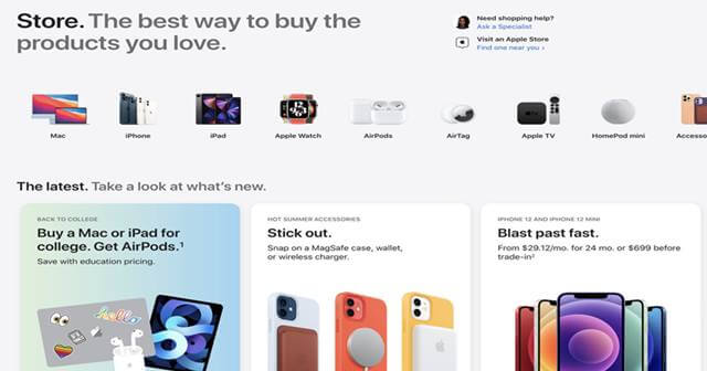
The new online store has more cards of Apple products and links to their individual pages detailing more information on them. It’s now more mobile-friendly than suiting desktop view. Here’s more on it;
Apple Redesigned its Online Store
Apple’s online store website on Tuesday was down for a while, and nobody knew why. But, it was live with a new design equipping all the products and information. The redesigned online store has a refreshing look and is well suited for the mobile view now. In addition, it has plenty of cards showcasing the Apple products, and tapping on them will take you to a dedicated store page of them. This includes more pictures of the product, technical specifications, descriptive information, shopping guides, accessories, and a support section. The mobile view of this new store is smooth, with horizontal scrolling of cards being so good. Apart from these design changes, no new products are being listed or the purchase pages modified. Instead, we hope the shuffling to the online store was done to equip the incoming products and make them look more appealing and informative. These are Airpods, the new MacBook Pro, and iPhone 13 series, coming this year’s fall. There have been many leaks regarding the iPhone 13 series and other upcoming products, but no clear date on them yet. As it’s rumored that Apple is enriching features in the upcoming iPhone 13 series and MacBook Pro variants, we expect more people to flock around the online store for learning and buying things. Thus, it makes sense that Apple’s redesigning of the website should be helpful and appealing.

